The digital editing of the Mary Hamilton papers is an ambitious project that relies on lots of hard work behind-the-scenes from many partners at the University and at times demands some advanced technical wrangling! Following the recent migration of a large cache of transcribed letters to their new home on the Manchester Digital Viewer, David Denison reflects on the process.
What leads up to migration, and what follows? Our still-in-progress internet edition was ‘migrated’ to Manchester Digital Collections (MDC) – and got several times larger – late on Friday 18 February 2022, after an increasingly hectic scramble to get things ready over the preceding months, weeks and days. Was it worth it? Spoiler alert: Yes, very much so! Here’s some background on what was involved.
The Hamilton editing team of David, Nuria, Tino, Cassie and Christine had been working hard in the second half of 2021 to complete our target list of transcriptions in time, alongside elaboration of our editing protocols, and wrestling with problems of sequencing, splitting or merging of certain letters. We got there, just about; we knew that a few transcriptions and a lot of checking would remain to do. Meanwhile MDC was in constant development under the benevolent (to us, anyway!) eye of Bryan Archer (Project Manager, Digital Collections), with the nuts and bolts of MDC in the hands of experts in the University of Manchester Library, including Tom Higgins (Software Developer), Pete Morris (Library Applications Developer), Charlotte Hoare (Special Collections Librarian), Gwen Riley Jones (Imaging Manager), Jo Castle (Imaging team) and others.
It had always been the plan that our edition would wind up in MDC, and an initial sample of 52 Hamilton letters had been included in MDC’s launch portfolio in January 2020. Meanwhile the offering of letters on our project website (where this blog sits) had climbed to 590 items, including the chronologically arranged correspondence between Mary Hamilton and George, Prince of Wales (on which see Sophie’s long blogpost). The display of transcriptions on our website has been progressively tweaked to include mark-up for new features encountered in documents we are editing, and to provide more and clearer information in tooltips, notes and metadata. See here our Editorial policies page. In the first year or so of MDC, however, not very much changed in the look of our sample collection. I think it’s fair to say that we thought that ‘our’ transcription display was better than MDC’s, while recognising from the start that MDC’s image display was much better than ours.
That contrast also reflects the histories of each site. Most of the Hamilton Papers are fairly humdrum as objects, unlike some of the beautiful manuscripts and museum objects elsewhere in MDC:
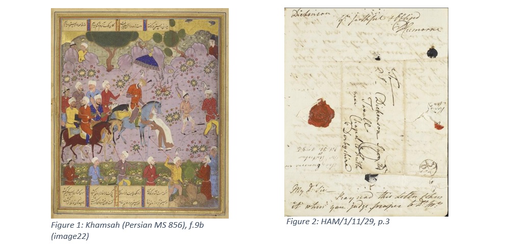
That is not to deny that good images are crucial for the textual content and sometimes the transmission history too, and many Hamilton researchers will work primarily with the images.
Our goal is to produce a high-quality scholarly edition, so for us the display of transcriptions was a core requirement. MDC is image-centred. This has other consequences. On our project site, any computer or tablet screen wide enough for two tabs side by side will always have the diplomatic transcription on the left, with the user choosing which tab they wish to have facing it (normalised transcription, metadata, or PDF image). MDC, on the other hand, always has the image on the left, again with a choice for the right-hand side. Our site and now MDC too remember the user’s choice for the whole of a browser session.
On the road
From summer 2021 we began to upload groups of letters into the staging area of MDC, visible to us but not live on the web. That’s when Nuria, Tino and I began to be more concerned about the transcription display. Tom Higgins had already thrown us a few crumbs (such as a distinction between normal s and long ſ in diplomatic, but ordinary s throughout in normalised). Later there were more, for instance the possibility of indented, centred and right-aligned text, as on our site. We felt that such on-screen layout made it easier for the reader to relate image and text at a glance. Likewise, where we moved stretches of text away from their manuscript location into logical reading order, we would mark the original position with a little solid triangle plus explanatory tooltip. Tom implemented that in MDC too.
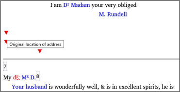
Then came more thoroughgoing updates, such as the buttons so crucial for correspondence, yet absent in the Cambridge package that MDC is built on:

Meanwhile, Pete Morris had organised a link to our personography, giving a tooltip when you mouse over a person mentioned in the diplomatic transcription, as we already had on this site. On MDC, the tooltips work on tablets and phones too, by touch rather than the non-existent mouseover.
In the weeks and even days leading up to going live, Tom’s goodies came thick and fast. And any problems of correlation between image and page were fixed incredibly promptly by Charlotte Hoare and Jo Castle, including the insertion of a missing image noticed just two days before migration, and supplied within hours by Laura Hobbs of the Royal Archives.
Here now
We’ve been getting used to MDC, and it feels more and more like home. Tom has patiently tweaked the display of transcriptions to accommodate as many of our wishes as possible, to the extent that the two sites offer comparable textual displays. In one or two respects, perhaps ours still has the advantage, but there are others where MDC goes one better already. One such example is seen here, where Hamilton has added ‘here when we met’ above the fourth line, and then squeezed in ‘on Mond’ above that:
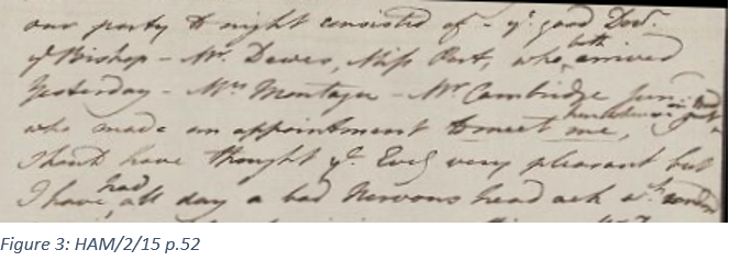
Our website has this:
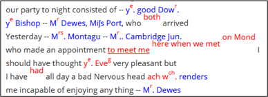
and it’s only by good fortune that the double insertion doesn’t collide with text in the line above. But MDC copes better:
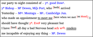
When there’s an annotation consisting solely of a person’s name (usually the writer of the letter), two potential tooltips are in conflict: the name and life dates of the person, and the identity of the annotator. On our website, it’s the person that wins:

In MDC, you get both:

As for dates of letters in the Metadata tab, what we select on our website is the date of sending, whereas MDC shows date of creation, date of sending (sometimes different) and even date of receipt if known:

Both platforms allow cross-references to other items in the edition, but MDC’s hyperlinks can jump to a specific page in the target file, or to an entry in the ELGAR catalogue.
While our site allows (or forces!) you to scroll through the whole document at once, for transcription or image separately, in MDC you can only step through it one page at a time, image + transcription. Given that our edition now includes most of Hamilton’s diaries, one of them 167 pages long, the page-by-page display is a happier choice – and as a bonus, you can instantly jump to a particular page. What’s more, each document loads very much faster, despite MDC’s higher-resolution images.
On editorial notes it’s probably an honourable draw. Our notes are endnotes, right at the end of the document, numbered sequentially throughout. I was rather proud of having arranged hyperlinks for instant jumping from lemma number to note and back again, even in a long document. MDC has easily accessible footnotes, numbered afresh on each page.
The road ahead
For the time being, we’ll retain the presentation of the edition-in-progress on our project website. At the time of writing we have 14 diaries and 1456 letters and lists available on either platform from this table of texts. There are another 88 letters being edited at the moment, and we hope to add a few more beyond that in the summer. The two remaining diaries should be added as well, as well as images of the material lent by the Lancashire Archives at Preston. Meanwhile we’re still correcting and improving what’s already live. Funding officially dries up at the end of November 2022, and our edition of the Mary Hamilton Papers is expected to be launched in Spring 2023.
Before then, apart from additional texts and images, there is much more to come. MDC will gain a contents page for the collection, allowing the user to select from (probably) dropdown lists of shelfmarks, authors, recipients and dates. The general search facility in MDC will be improved. Metadata will acknowledge the many students and volunteers who have contributed transcriptions. The personography will be filled out, and instead of just name and life dates you will have the option of jumping to a fuller entry for that person. Such an entry should have detailed life dates, show all titles, variant spellings of names, shortenings, nicknames and codenames, and offer either a brief biography or links to authority files. Making use of the HEURIST data management system, we’ll be displaying some of the social network information in graphical form.
Meanwhile, separately from MDC, we will have a version of the corpus tagged for part of speech and indexed for the CQPweb search engine. This should allow any user to search easily for words or strings in plain normalised text, or to formulate wildcard, proximity and other elaborate searches, optionally including part-of-speech information for the linguists among us, and among our users. Although the search strings will be entered in modern (normalised) form, the hits will be displayed in original (diplomatic) form. Our detailed editorial protocols will be made available for consultation. We’re also looking into convenient links to international indexes of correspondence and to and from other correspondence projects.
Given that six of us are now working on our four research strands too, it’ll be another busy year for sure. Migration is not the end of the road!
David Denison
February 2022
